




Picture this: You’ve just walked into a weekend farmers’ market. There are two candle vendors side by side. Both make beautiful products. Both have tidy tables and cheerful signs. But when you pick up their respective business cards, something shifts.
One card is thin, slightly glossy, printed on something that feels vaguely like it came out of a home office laser printer. The font is a little off. The logo looks stretched. You set it down without thinking.
The other card is thick. Substantial. There’s a soft-touch matte finish that makes you want to keep running your thumb across it. The colors are rich and true. The logo sits clean and confident. Without reading a single word, you already trust this vendor more.
That’s not an accident. And it’s not vanity. That’s your brand speaking before you open your mouth.
“Your printed materials are the handshake your brand gives before you say a word.”
The Logo Trap
Here’s something most small business owners don’t realize: their logo is almost never the first impression their business makes.
Think about the last time a potential customer actually encountered your logo in a meaningful way. It was probably on a piece of paper. A card. A flyer. A postcard tucked under a windshield wiper or left on a coffee shop counter.
We spend enormous energy and money on logos, and don’t get me wrong, a great logo matters. But the logo is just one layer. What most business owners overlook is the physical object it lives on. And that object is doing at least as much communicating as the logo itself.
The weight of the paper. The feel of the surface. The precision of the cut. The richness of the ink. These are not trivial details. They are your brand, made tactile.
Percival’s Note
I’ve seen gorgeous logos get undermined by thin, flimsy paper more times than I can count. It’s like showing up to a job interview in a perfectly tailored jacket and worn-out shoes. People notice the whole picture.
Why Touch Changes Everything
Neuroscientists have a term for it: “haptic perception”, the way our brains process information through touch. And the research is pretty clear: physical objects are processed differently than digital ones. They create stronger memory traces. They carry more emotional weight.
Studies on direct mail consistently show that physical marketing materials generate higher brand recall than their digital equivalents. When someone holds something in their hand, their brain encodes it differently than when they scroll past it on a screen. The tactile experience makes the brand feel real in a way that pixels simply cannot replicate.
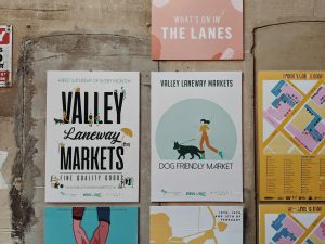
For local businesses in particular, this is a significant competitive advantage. You are not competing with national brands on Instagram impressions or Google ad spend. You are competing in a community at markets, in storefronts, at events, and through word of mouth. And in that world, physical materials are your most powerful marketing tool.
“For local businesses, print IS the brand experience. Not a supplement to it.”
What Your Printed Materials Are Actually Saying
Every printed piece you put into someone’s hands is making a statement. The question is whether you’re in control of that statement.
Here’s what different choices communicate:
| Print Choice | What It Signals | What It Costs You |
|---|---|---|
| Thick, matte-finish card stock | Quality, intention, permanence | Nothing — this is the investment |
| Thin, flimsy paper | Budget constraints, low priority | Customer confidence before they’ve tried you |
| Vibrant, true-to-brand colors | Attention to detail, pride in craft | Nothing — this earns trust |
| Washed-out or inconsistent color | Carelessness, corner-cutting | The premium perception you worked for |
| Clean trim and precise finish | Professionalism, reliability | Nothing — signals you care |
| Uneven cuts, cheap printing | Rushed, generic, forgettable | The second look you needed |
The Mistake Most Local Businesses Are Making
I want to be honest with you here, because I think it matters.
The most common print mistake I see isn’t a bad logo or an off-brand color. It’s the assumption that “good enough” is fine because customers are buying the product, not the paper it’s printed on.
But here’s the thing: by the time a customer is evaluating your product, your printed materials have already shaped how they feel about you. The loyalty card tucked into the bag at checkout either reinforces the quality of the experience or quietly undermines it. The postcard on the counter either pulls someone in or gets ignored.
Print is not a detail. It’s a decision.
And the businesses in your neighborhood who are getting this right? They’re not just spending more money. They’re being more intentional. They’re thinking about what they want a customer to feel the moment something lands in their hand.
A question worth sitting with: Pick up your current business card right now. If a stranger found it on the ground, would it make them want to visit your store or throw it away?
The Local Advantage Nobody Is Talking About
Here’s the good news: most of your competitors aren’t thinking about this at all.
Big-box retailers and national chains spend their marketing budgets on digital advertising. They’re not thinking about the texture of a business card. They’re not crafting a loyalty card that feels like it belongs in someone’s wallet.
That’s your opening.
As a local business, your physical presence in the community is something no national brand can replicate. A beautifully printed postcard in the right place, a loyalty card that customers actually keep, a flyer that someone pins to their bulletin board instead of recycling these things, builds a kind of community presence that digital ads never will.
The businesses that win in local markets are the ones that show up consistently, with quality. Not just in their products, but in every piece of themselves they hand to the world.
“Your competitors are fighting for clicks. You’re fighting for a place in someone’s wallet, their fridge, their bulletin board. That’s a completely different game.”
Three Things You Can Do This Week
You don’t need to overhaul everything at once. Start here:
- Do the hand test. Pick up every printed piece your business currently uses. Hold each one. How does it feel? Thin and flimsy, or substantial and intentional? This is the fastest way to see your brand through a customer’s eyes.
- Identify your highest-impact piece. For most local businesses, it’s the business card or the loyalty card the thing that gets handed to customers most often. Start there. Upgrade the stock, the finish, the color fidelity. One great piece changes the perception more than five mediocre ones.
- Think about the moment, not just the material. Where does each printed piece land in your customer’s hands? A postcard left on a café table needs to earn attention fast. A loyalty card handed at checkout needs to make someone feel valued. Design for the moment, not just the brand guidelines.
Your Brand Deserves to Be Felt
In a world of infinite digital noise, physical materials are quietly becoming one of the most powerful tools in a local business’s arsenal. Not because they’re old-fashioned. Because they’re real.
When someone holds something you’ve made, something that has weight and texture and color and craft, they’re holding a version of your brand in their hands. That moment is yours to own.
Don’t let it be an afterthought. Let it be a statement.
Ready to make your brand felt?
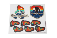
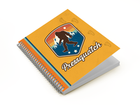
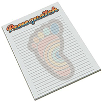
Pressquatch specializes in small-batch, fast-turnaround printing for local businesses that take their brand seriously. Business cards, postcards, loyalty cards, flyers — all printed with the quality your community deserves.
Let’s talk about your next print run. → pressquatch.com