



There’s a moment most designers never get to see, and it’s the one that matters most.
It happens after the work is done. The logo is approved. The palette is locked. You’ve delivered the brand guidelines, walked the client through every page, and watched them nod at the part about minimum clear space even though you’re fairly sure they’ll forget it by Thursday. The invoice goes out. You move on to the next project. And the brand you just spent weeks building gets up off your screen and walks out into the world on its own two feet.
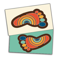
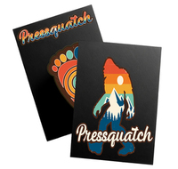
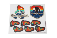
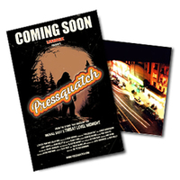
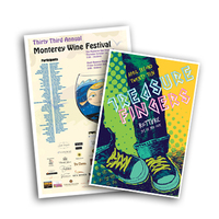
It goes onto a business card handed across a table at the Hillsdale Farmers Market. It goes onto a sticker pressed to the lid of a laptop in a coffee shop on Alberta. It goes onto a postcard pinned to a corkboard in an office break room where nobody has ever heard your name and nobody ever will. It shows up in a hundred rooms you will never walk into, in front of people you will never meet, doing the one job you built it to do — and you are not there to see whether it does that job well.
That’s the room you’re not in. And in that room, your brand is doing all the talking.
I’ve spent a long time on the other side of this — the supply side, the press side, the part of the process that happens after the design is final and before it reaches a human hand. From down here on the floor, I’ve watched beautiful work land exactly the way its designer intended, and I’ve watched beautiful work quietly fall apart in translation. And I’ve come to believe something I think every freelancer should sit with for a minute: a brand isn’t what you present in the final deck. A brand is what survives contact with the physical world after you’ve gone.
The Screen Is Not the Finish Line
Here’s the trap, and it’s an easy one to walk into because everything about our tools encourages it. You build a brand system in Figma. It is immaculate. The spacing is mathematical, the type scale sings, the colors are exact down to the hex value. You present it on a calibrated monitor in a clean little deck, the client says the magic word, and it feels finished. It looks finished. On the screen, it is finished.
But your client doesn’t hand their customers a Figma file. They hand them things. And a thing is a different animal entirely. It has weight. It has a surface that catches light. It has a texture your fingertips read before your eyes catch up. The green you nailed on screen lands one way on uncoated stock and a noticeably different way on a glossy card — warmer here, flatter there, never quite the RGB you approved because ink and paper don’t play by the rules of a backlit display. The logo that breathed beautifully at full resolution gets shrunk onto a pen, stretched across a tote bag, reversed out of a window cling. Every one of those moments is a translation, and every translation is a place where the brand you designed either holds its shape or quietly loses it.
And you are not there for any of it. You don’t get to stand at the press and say, no, warmer, that’s not our green. You don’t get to feel the card stock and say, this is too thin, it makes us feel cheap. The work leaves your hands and starts making decisions without you. For a freelancer, that’s the uncomfortable truth at the center of the job: your reputation isn’t really made in the pitch meeting. It’s made, quietly and continuously, in the consistency of a thousand small physical touchpoints you never get to supervise.
Your brand isn’t what you present in the final deck. It’s what survives contact with the physical world after you’ve gone.
Consistency Is a Feeling, Not a Rulebook
We talk about brand consistency as if it were a compliance problem. Match the hex code. Use the approved lockup. Mind the clear space. Don’t stretch the logo. All true, all useful, and all completely beside the point from where the customer is standing — because no customer has ever experienced a brand as a checklist. They experience it as a feeling.
Specifically, they experience consistency as the sense that everything came from the same place. The same hands. The same standard of care. They can’t articulate it and they’d never try, but they feel the difference between the boutique whose business card has a satisfying heft, whose loyalty card feels like it was meant to last, and whose window poster is crisp and considered — and the boutique whose materials are each just slightly off from one another, as if assembled by three different people who never spoke. One feels intentional. The other feels accidental. And here’s the quiet part: people trust intentional. They read care as competence, because in their experience the two usually travel together.
The most common way that feeling breaks isn’t a dramatic failure. It’s drift. The brand blue gets ordered from one printer for the cards, a different printer for the banner, an online vendor for the stickers, and somewhere in the gift-shop chaos a fourth source for the tote bags — and now there are four blues wearing the same name. No single piece is wrong enough to notice on its own. But laid side by side, they tell the customer a story the designer never wrote: that this brand isn’t quite paying attention. That’s the gift you give a client when you extend a brand system into the physical world with intention. You make their care visible in every room they can’t personally be in.
The Physical Brand Audit: A Checklist You Can Steal
So here’s something practical — a tool you can run for any client, and one I’d gently suggest you run before you ever pitch a print refresh, because it tends to make the case for you better than any deck could. It’s low-tech on purpose. Gather every physical thing the client puts into a customer’s hands and lay them all out on one table under one light:
- Every business card
- Every sticker
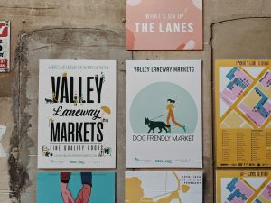
- Every rack card and postcard
- Every piece of packaging
- Every sign and window cling
Then walk down these five questions, slowly, the way a customer’s eye actually would.
- Does it all look like it came from the same forest? Put every piece side by side and look only at consistency. Are the colors actually matching, or has that blue drifted across vendors and seasons? Do the typefaces agree with each other? Does the logo appear at the same proportions and with the same breathing room everywhere it shows up? Mismatched color across touchpoints is the single most common leak I see, and it almost always traces back to the same root cause: pieces ordered at different times, from different places, with no shared color reference holding them together. Naming this is often the whole audit. Once a client sees their four blues in a row, they can’t unsee it.
- Does every piece have exactly one job? Go through each item and try to name its single job in one word — introduce, remind, reward, direct, delight. The business card introduces. The loyalty card rewards. The rack card directs. If a piece is trying to do three of those at once — a card that’s also a mini-brochure that’s also a coupon — it’s doing none of them cleanly, and that’s a design problem hiding inside what looks like a print problem. Clarity of purpose is what lets a piece be designed, and printed, well.
- Does the quality of the object match the promise of the brand? This one is felt before it’s seen. A premium boutique that hands out a flimsy card on the thinnest available stock is contradicting itself in the customer’s fingers — the brand says considered, the object says afterthought. The physical substrate is part of the voice. Weight, finish, the crispness of a trim, whether a corner is rounded with intent or just cut — all of it communicates before a single word is read. Match the object to the promise, or the object quietly undermines the promise.
- Is anything orphaned or outdated? Hunt for the ghosts. The old logo still riding on the punch cards. Last year’s offer on a stack of postcards that never ran out. A phone number that changed two moves ago. Orphaned materials are brand liabilities hiding in plain sight, and they almost always survive for the same dull reason: somebody over-ordered them once, and nobody wants to throw away a box that still has things in it. Find them, and make the call to retire them. A current brand can’t afford to keep speaking in an old voice.
- What’s missing entirely? Sometimes the most important finding is a blank space. No leave-behind for the client to hand a prospect. No thank-you card for a first-time customer. No branded anything wrapping the product people literally carry out the door. The absence of a touchpoint is itself a consistency problem — a silence at exactly the moment the brand had a chance to speak and didn’t. Map the customer’s actual journey and look for the gaps. The opportunities are usually sitting right in them.
Become the Keeper of the Brand
Run that audit for a client once and something shifts in how they see you. You stop being the person who made their logo back in the spring and become the person who watches over their brand out in the world — the one who notices the drift, catches the orphan, closes the gap. That’s a different relationship, and a far stickier one. It’s also, not by accident, the relationship that pays. Brands don’t need a new identity every year. But they always need their physical presence kept sharp, current, and consistent — which means there’s always a reason for the client to call you back.
And honestly, this is the part of the work I care about most from where I’m standing. The creative community in this city — the freelance designers, the brand consultants tucked into shared studios in Buckman, the folks who’ll argue with genuine feeling about a paper weight — these are our people. When you bring a brand system to us in good shape, with a clear point of view and specs you’ve actually thought about, we can make the physical version hold together as faithfully as the version on your screen. We can get the green right. We can match the stock to the promise. We can make sure the thing a customer holds is the thing you designed.
Come Build the Physical Half With Us
If you’re a designer building brand systems for businesses around Portland, try thinking of the print run not as the boring last errand but as the moment your work finally meets the world. Bring us the audit. Bring us the questions you couldn’t answer on screen — which stock, which finish, how this green is going to behave on an uncoated card. We’ll help you get the physical translation right, so the brand you designed is the brand your client’s customers actually hold in their hands.
Because the room you’re not in is most of them. Let’s make sure your work sounds like itself in every single one.
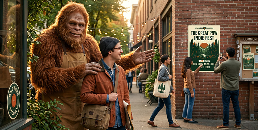
Pressquatch · Legendary Prints, Big Impact.